How I did a test task
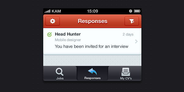
 About 2 months ago I saw a blog post with vacancy of “Mobile designer” for one russian company called HeadHunter (it’s something like LinkedIn in Russia). That vacancy had a test task, I love to practice in free time, so I decided to make it, just for fun. In this post I wanted to tell about some process of my work.
Because why not? :)
Task
So, here’s a text of the task (poorly translated from Russian by me):
“Every сandidate on the hh.ru has a page with responses and invites from employers. Design a layout of this page for mobile platform of your choice”
Analysis of page
First of all, I decided to look at the page and try to determine its main blocks, that’ll be transferred to the mobile screen. Our app is mobile, so we can’t just move everything that we see to the screen, it’ll be a mess and user will be confused by all these fancy things going on there.
Actually, “analysis” is kinda big word for this page — it’s quite obvious what will be on the mobile screen:
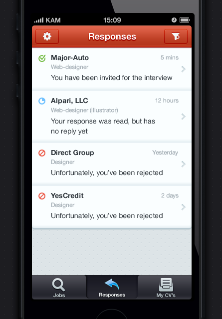
- Content: List of responses
- Tab bar: Main sections of the site
- Navigation bar: Settings and Response filter
Content: List of responses
 I think that most of the cases user will see repsonses for the same type of vacancies (you’ll rarely see designer who’s trying to find work of cook or security guard of small shop in criminal city district). So beause of that I decided that name of company is more important in the response and I highlighted it first with bold font and only then I added vacancy name and response text. More information of response should be shown when user opens detailed view of the response by tapping on it.
![]() Instead of color coding of the whole row cell I deciced to draw icons for each response statuses (because, I love icons you know).
Instead of color coding of the whole row cell I deciced to draw icons for each response statuses (because, I love icons you know).
Tab bar: Main sections
![]() Main sections of the app are:
Main sections of the app are:
- Jobs search
- Responses
- My CV’s
I drew icons for each section and placed them into tab bar
Navigation bar: Settings and Response filter
I had some problems in deciding what color to use in the navigation bar. Web site has main colors of blue, gray and red. In the final I decided to choose red, because this color exist in logotype and because it’s a color of love*
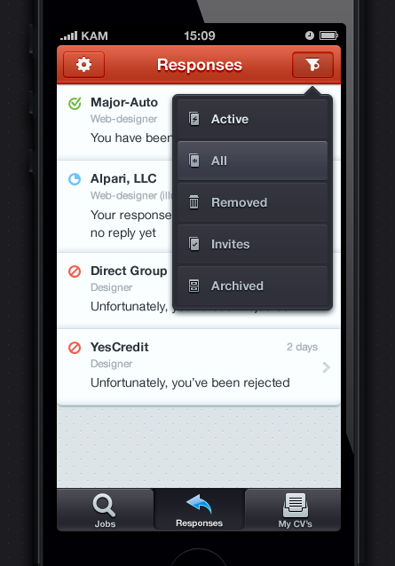
On the navigation bar I placed settings button and button for response filter, which represented as popup with list of all types of responses. For each type I drew an icon: I also had an idea to dynamicly change icon on the navigation bar depending on what filter type was choosen. But this could confuse user, because some of the response types visually are matching with standart functions like Delete and Archive.
That’s all, Folks!
I guess that’s all. I worked on this view at the beginning of December 2012, so some things I would do differently today. For example I could replace filter popup with some kind of side menu.
Anyway, that was something from my process, hope it was intresting for you. See you in comments or Twitter replies ;)


Discussion